
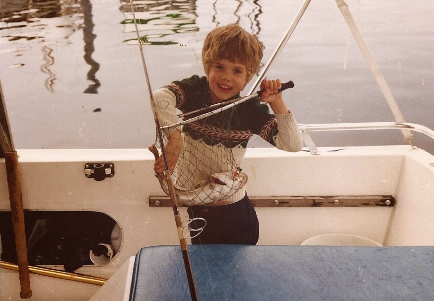
That’s me, somewhere around six, completely thrilled about a fish. Still at it – most of what I draw is somewhere I went fishing first. The Thorofare, the Tetons, half the water in between. I’m not usually there to look at the scenery, which might be why I notice it.
The illustrations are flat color and hard light – no gradients, no blending, no soft transitions anywhere. Sometimes that means three shapes. Sometimes a few thousand. What doesn’t change is that every edge is a decision: where one thing stops, where the next starts, and whether light is touching it.
Blame the light
Coffman Cove, Ketchikan, Anchorage, Alaska. Twisp, Omak, Okanogan, Winthrop, Washington. Palm Springs, California. Jackson Hole, Wyoming. Columbia, Missouri. We moved like we were being followed. What that gets you is a strangely specific education in light: flat gray coastal light, winter light off snow that reduces everything to brightness, shadow, and hard contrast, and the Palm Springs kind that hits a stucco wall at four in the afternoon and turns the whole thing into two colors and one sharp edge.
What stayed with me was how much light can do by itself. Snow and shadow can turn a whole landscape into contrast and shape. Desert light can do the same thing to a wall or a roofline. That is the part I keep coming back to.
Nuts and Bolts
Medium: Digital illustration
Style: Flat, geometric, small palettes
Usual subjects: National parks, deserts, mountains, modern architecture, roadside Americana
Inspiration: WPA travel posters, screen printing, mid-century graphic design, high-contrast landscape photography
Who I learned from
Everybody’s got a bibliography. Here’s mine.
Charley Harper
Charley Harper is a big one for me. He called it “minimal realism.” His whole idea was to leave out everything that did not matter. He was not interested in counting every feather, just in getting the bird right. That way of seeing has stuck with me.
Billy Schenck
A big one for me. He took the American West and flattened it into hard-edged shapes and clean blocks of color without draining it of character. That connection between western subject matter and graphic simplification feels very close to what I like.
Andy Warhol
Mostly for permission. He came out of commercial illustration and never acted like that was something to apologize for. I like the directness of that. Sometimes surface is not a shallow thing. Sometimes it is the whole point.
Tom Thomson
The outlier here, but an important one. His work is not flat the way mine is, but he knew how to simplify a landscape without killing it. The Jack Pine especially stays with me. It is stripped down, but it still feels alive.