Palette
| Blue | #47B9DE | |
| Charcoal | #4F5257 | |
| Muted rust | #977E71 | |
| Blue | #3C9AB7 |
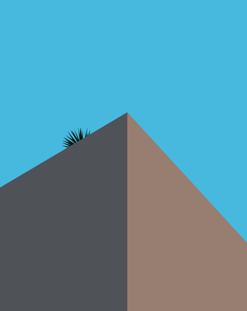
Two walls, one corner, and something growing up there that nobody planted.
Notes
Three shapes and a trespasser
Two-thirds of this drawing is empty sky. That’s not restraint for its own sake – it’s what looking up actually does. Stand close enough to a building and the thing itself drops to a wedge in the bottom of your vision while sky takes everything else.
Both walls are the same paint. One faces the sun and one doesn’t, and that alone splits them into a cool grey and a warm brown with nothing in between. From this angle the corner reads as a single line running straight down the middle, which is the only thing telling you this is a solid object and not two flat panels leaning together.
The plant is a yucca or an agave, and it got up there without permission. Roofs collect windblown seed and just enough grit in the parapet joints for something to take hold. Nobody waters it. It’s there because the building has a flat top and time passed. Only the spikes clear the roofline, so you’re seeing maybe the top fifth of whatever it is.
Four colors, and three of them are single uninterrupted fields. No texture, no edge treatment, no gradient anywhere. Which means the entire drawing is riding on where those two diagonals cross and how far off-center the plant sits – put it at the corner and it’s a logo, push it too far left and it falls out of the composition. The spikes are the only fine detail in the piece, and they’re carrying all of it.